Grid는 여러 가지 기능을 복합적으로 가진 패널입니다. 실버라이트에서 Canvas 패널과 함께 가장 많이 쓰이는 패널중에 하나입니다. 특히 실버라이트는 그리드를 기본 패널로 하고 있으며, 여러 행과 열로 자식 엘리먼트를 배치 할 수 있도록 해 주며 이를 조절할 수 있는 기능을 제공해 줍니다. 그리드를 통해서 작업하는 것은 HTML 안에서 테이블로 다루는 것과 아주 유사합니다.
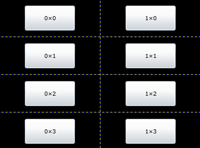
4×2 행과 열을 만들고 기본적으로 1셀에 1개의 자식 엘리먼트를 집어넣는 예제입니다.
<UserControl x:Class="ControlTest13.Page"
xmlns="http://schemas.microsoft.com/winfx/2006/xaml/presentation"
xmlns:x="http://schemas.microsoft.com/winfx/2006/xaml"
Width="400" Height="300">
<Grid x:Name="LayoutRoot" Background="Black" ShowGridLines="True">
<!--네 개의 행을 선언-->
<Grid.RowDefinitions>
<RowDefinition />
<RowDefinition />
<RowDefinition />
<RowDefinition />
</Grid.RowDefinitions>
<!--두 개의 열을 선언-->
<Grid.ColumnDefinitions>
<ColumnDefinition />
<ColumnDefinition />
</Grid.ColumnDefinitions>
<!--자식 엘리먼트를 배치-->
<Button x:Name="btnL1" Content="0×0" Width="100"
Height="50" Grid.Column="0" Grid.Row="0" />
<Button x:Name="btnL2" Content="0×1" Width="100"
Height="50" Grid.Column="0" Grid.Row="1" />
<Button x:Name="btnL3" Content="0×2" Width="100"
Height="50" Grid.Column="0" Grid.Row="2" />
<Button x:Name="btnL4" Content="0×3" Width="100"
Height="50" Grid.Column="0" Grid.Row="3" />
<Button x:Name="btnR1" Content="1×0" Width="100"
Height="50" Grid.Column="1" Grid.Row="0" />
<Button x:Name="btnR2" Content="1×1" Width="100"
Height="50" Grid.Column="1" Grid.Row="1" />
<Button x:Name="btnR3" Content="1×2" Width="100"
Height="50" Grid.Column="1" Grid.Row="2" />
<Button x:Name="btnR4" Content="1×3" Width="100"
Height="50" Grid.Column="1" Grid.Row="3" />
</Grid>
</UserControl>
예제에 표시된 점선은 Grid의 설정을 강조하기 위해 Grid 컨트롤 안에 ShowGridLines="True" 프로퍼티를 선언하였습니다.
Grid.Column="0" Grid.Row="0" 프로퍼티를 사용하여 Grid안에 자식 엘리먼트의 위치를 지정합니다. Column과 Row의 값이 각각 0이면 가장 처음 셀에 위치합니다.
RowDefinitions 엘리먼트는 행을 만들며 그안에 RowDefinition 엘리먼트 개수는 행의 개수를 지정합니다.
 invalid-file
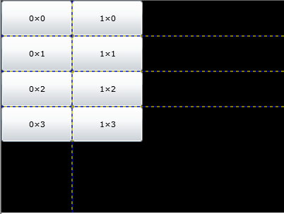
4×2 행과 열을 만들고 기본적으로 1셀에 1개의 자식 엘리먼트를 집어넣으며 엘리먼트의 Height와 Width의 크기만큼 Grid 셀을 자동으로 결정하는 예제입니다.
Xaml
<UserControl x:Class="ControlTest13.Page"
xmlns="http://schemas.microsoft.com/winfx/2006/xaml/presentation"
xmlns:x="http://schemas.microsoft.com/winfx/2006/xaml"
Width="400" Height="300">
<Grid x:Name="LayoutRoot" Background="Black" ShowGridLines="True">
<!--네 개의 행을 선언-->
<Grid.RowDefinitions>
<RowDefinition Height="Auto"/>
<RowDefinition Height="Auto"/>
<RowDefinition Height="Auto"/>
<RowDefinition Height="Auto"/>
</Grid.RowDefinitions>
<!--두 개의 열을 선언-->
<Grid.ColumnDefinitions>
<ColumnDefinition Width="Auto"/>
<ColumnDefinition Width="Auto"/>
</Grid.ColumnDefinitions>
<!--자식 엘리먼트를 배치-->
<Button x:Name="btnL1" Content="0×0" Width="100"
Height="50" Grid.Column="0" Grid.Row="0" />
<Button x:Name="btnL2" Content="0×1" Width="100"
Height="50" Grid.Column="0" Grid.Row="1" />
<Button x:Name="btnL3" Content="0×2" Width="100"
Height="50" Grid.Column="0" Grid.Row="2" />
<Button x:Name="btnL4" Content="0×3" Width="100"
Height="50" Grid.Column="0" Grid.Row="3" />
<Button x:Name="btnR1" Content="1×0" Width="100"
Height="50" Grid.Column="1" Grid.Row="0" />
<Button x:Name="btnR2" Content="1×1" Width="100"
Height="50" Grid.Column="1" Grid.Row="1" />
<Button x:Name="btnR3" Content="1×2" Width="100"
Height="50" Grid.Column="1" Grid.Row="2" />
<Button x:Name="btnR4" Content="1×3" Width="100"
Height="50" Grid.Column="1" Grid.Row="3" />
</Grid>
</UserControl>
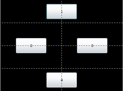
다음 예제는 HTML의 ColSpan, RowSpan 처럼 두개의 셀을 합쳐서 쓰는 효과를 Grid에서도 다중의 셀을 합쳐서 하나의 셀로 사용할 수 있도록 하는 효과입니다.
Xaml
<UserControl x:Class="ControlTest13.Page"
xmlns="http://schemas.microsoft.com/winfx/2006/xaml/presentation"
xmlns:x="http://schemas.microsoft.com/winfx/2006/xaml"
Width="400" Height="300">
<Grid x:Name="LayoutRoot" Background="Black" ShowGridLines="True">
<!--네 개의 행을 선언-->
<Grid.RowDefinitions>
<RowDefinition />
<RowDefinition />
<RowDefinition />
<RowDefinition />
</Grid.RowDefinitions>
<!--두 개의 열을 선언-->
<Grid.ColumnDefinitions>
<ColumnDefinition />
<ColumnDefinition />
</Grid.ColumnDefinitions>
<!--자식 엘리먼트를 배치-->
<Button x:Name="btnL1" Content="1" Width="100"
Height="50" Grid.ColumnSpan="2" />
<Button x:Name="btnL2" Content="2" Width="100"
Height="50" Grid.RowSpan="4" Grid.Column="0" />
<Button x:Name="btnL3" Content="3" Width="100"
Height="50" Grid.RowSpan="4" Grid.Column="2" />
<Button x:Name="btnL4" Content="4" Width="100"
Height="50" Grid.ColumnSpan="2" Grid.Row="3" />
</Grid>
</UserControl>
ColumnSpan과 RowSpan은 한개의 자식 엘리먼트를 여러개의 셀을 합쳐서 사용하고자 할때 사용합니다.
'.NET WPF' 카테고리의 다른 글
| Silverlight 2 Controls Review - GridSplitter (0) | 2008.10.22 |
|---|---|
| SilverlightContrib Controls 릴리즈 (0) | 2008.10.21 |
| Silverlight 2 Controls Review - Grid 2 (1) | 2008.10.18 |
| Silverlight 2 RC1 Tool 한국어버전 출시 (0) | 2008.10.17 |
| Silverlight 2 Controls Review - StackPanel (0) | 2008.10.17 |
| Silverlight 2 RC1(RTW) 설치(VS2008 영문버전 기준) (0) | 2008.10.14 |
| Silverlight 2 Released!! - x줄타게 기다렸습니다. (0) | 2008.10.14 |


댓글